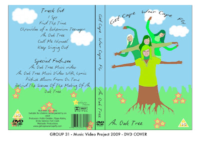
 This is our DVD cover. It includes all the conventions such as DVD logo, production logo, rating and bar code. It includes the track lists and run time. The colours and images are all related to our video to keep consistency.
Friday 27 November 2009
DVD cover
 This is our DVD cover. It includes all the conventions such as DVD logo, production logo, rating and bar code. It includes the track lists and run time. The colours and images are all related to our video to keep consistency.
Labels:
Emily Skinner,
Fern Clark,
Hollie Godden,
Pippa Atkins
1st week of youtube views
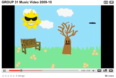 In the first week of our video being on youtube we have managed to get 54 views. But, 0 comments and o ratings.
Labels:
Emily Skinner,
Fern Clark,
Hollie Godden,
Pippa Atkins
Thursday 26 November 2009
Magazine cover
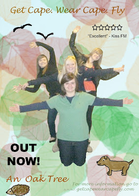
After reconsidering the conventions of a magazine cover we decided on this general image to promote our music video. The animals are from our music video to keep consistency and the leaves in the background keep the park theme. It features the band so that the audience knows clearly who the band are as they are not featured in the video.
We made it so our bodies look pencil drawn and we used the original picture so in a magazine people would recognize the band, where as if they were buying the DVD they would already know the band.
The rating has been added to show the audience how other music medias rate the album. The 'out now' text is clear so the date is obvious and the fans know they can purchase the album now.
Labels:
Emily Skinner,
Hollie Godden,
Pippa Atkins
Tuesday 24 November 2009
Analysis of DVD/CD cover

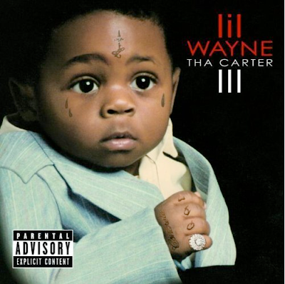 Below is the CD cover for Lil' Waynes album "Tha Carter III" As you can see from the picture of Lil' Wayne he has the same tattoos on his hands and face as the little boy on the album cover, suggesting that this was infact Lil Wayne when he was younger.It has got a very plain plain black background so all the focus is on Lil Wayne. Because the picture is of little wayne as a child, it could suggest that the songs are about his childhood and his life so far.
In the picture on this album cover, the writing is quite simple, but the top half says Lil Wayne in red, then you look at the picture of him and you can see he is wearing a red hat, so maybe the colour red means a lot to him. The parental advisory sticker that some of these songs could be quite inappropriate, and it says it has explicit content. By using a picture of a small child on a album with explicit content is quite risky as it could cause quite a lot of controversy. I think its very clever how they've made the little child seem to be a young Lil Wayne by putting all the tattoos on him, and the ring on his finger. It makes you wonder what all the tattoos mean, because hes obviously got them throughout his life so perhaps the songs might explain what they are and why hes got them.
Labels:
Fern Clark
Analysis of a dvd/cd cover
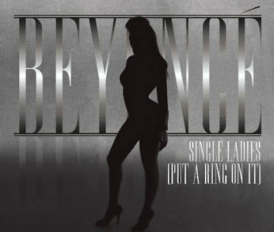 This CD cover is for Beyonce, put a ring on it. Beyonce is known for her strong and powerful voice, which is similar to this CD cover because the silhouette of Beyonce stands out and looks strong over the plain background.
 When fist looking at this CD cover it portrays a mysterious look. The plain grey background makes the audience draw their attention to the silhouette becuase this is the main feature of the CD cover. The silhouette stands out above everything else on the CD cover becuase the silhouette is of Beyonce. This Cd cover wouldnt be as effective if beyonce was not as well known as she is because without even looking at the text we know straight away that it is Beyonce as the silhouette.
The text is simple but effective. Just by the word beyonce we know exactly who it is even though the silhouette covers one of the letter we still know that it says beyonce. The text takes up over half of the background and the effect where the colour of the text is white in the centre and then gets darker as the size increases makes the text stand out. Although the CD cover is simple and doesn't have much on it, it's big and bold so it is very effective.
The CD cover also links with the song. The name of the song is called single ladies, the picture of beyonce on her own could be showing that she is a single lady.
Labels:
Emily Skinner
DVD/ CD cover analysis
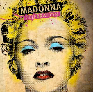 This image is used for a CD and DVD cover for Madonna. She is so idolized that there is no need to add too much detail to the design itself,even someone who is not a big fan of her music, knows who she is because she is in the medias eye so much. She has used this to her advantage as the overall product is rather simple yet eye catching.
The bright colours are eye catching and they represent the genre of music as well. The music is fun and fast paced and the colours imply this. Her name is clear to read along with the name of the album, it is drawn on as though paint has been splattered across the page which again give the feeling of being unique and slightly wild. 'Celebration' is also the name of one of her more popular songs and therefore fans will see this and want the rest of the songs.
Labels:
Pippa Atkins
Magazine cover
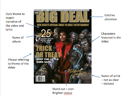 In this magazine advert for Micheal Jackson - Thriller the first thing we see is the main heading "BIG DEAL". This is too make you want to know what it is about and read on.
The colour scheme in this advert is very dull to match the narrative of the song and the lyrics. Micheal Jackson and the writing are the only things that stand out by using a vibrant red for his clothes and gold with white for the text. The red used for Micheal Jackson makes him stand out like hes an icon.
The characters on the the advert also feature in the music video in the same way . it is very effective how they all looking towards you because it is very surreal like the song and the music video.
The phrase "Trick or Treat Keep The Little Ones Safe..." is significant to Halloween and gives you a taste of what to expect in the video by making you think about all the people in the picture coming out into the streets.
The name of the artist, Micheal Jackson is not as clear as the rest of the text. This shows he is well known and idolized.
The video also contains the album and song name and a quote saying "The worlds biggest selling album of all time." This will make the person want to listen to it because its actually been quoted in the advert.
Labels:
Hollie Godden
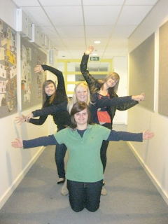
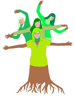
This image will feature in our magazine, and/or our DVD cover. I created this image on paint, it took about an hour and a half. We posed all together to try make the shape of a tree, then I took the image and traced over it to make it look like a cartoon and an oak tree. I am quite pleased with the outcome. I decided not to do the faces, because the image was so small it was hard to get any detail. Plus I think it would be nice for the "fans" to see what the band really looks like.
Labels:
Fern Clark
Thursday 19 November 2009
Feedback to final video
-Unique
-Looked time consuming
-Visuals matched lyrics
-Could have had faster paced images
-The magazine cover and DVD cover should match with music video
-Looked time consuming
-Visuals matched lyrics
-Could have had faster paced images
-The magazine cover and DVD cover should match with music video
Labels:
Emily Skinner,
Hollie Godden,
Pippa Atkins
Digipak
A digipak is a glamorous style of CD or DVD casing. We will be using a DVD digipak for our music which will include some features that are seen throughout our video.
The conventions of a dvd/cd for an album are:
Our magazine and dvd cover shall continue the themes expressed in the music video and carry over some of the images to keep some consistency.
The conventions of a dvd/cd for an album are:
- they feature the band on them clearly
- the colours represent the genre e.g. dark dull colours for more depressing song
- the font is bold and clear so the audience can read it clearly
- the dvd logo should be shown on the dvd cover
- the price may be shown
- a copyright logo should feature on both
Our magazine and dvd cover shall continue the themes expressed in the music video and carry over some of the images to keep some consistency.
Labels:
Pippa Atkins
Tuesday 17 November 2009
Looking back
Looking back to the Ben and Jerrys advert we think we did well in creating our music video with the same sort of theme and cartoon like features.
Labels:
Emily Skinner,
Hollie Godden,
Pippa Atkins
Scarf

After watching the video we feel that we need to add some things in to fill some gaps where isnt alot happening so we are going to add a scarf to the tree when it is bare which i made on photoshop.
Labels:
Hollie Godden
The final lesson
In our Final lesson Me Emily and Pippa rendered the whole video to be quicktimed to make the final deadline. During this lesson we managed to add clouds to the sky and were able to watch the whole video as one. We played around with the contrast and colour saturation to see if it made the cartoon effect more effective but we decided it looked better as it was. Also we got the chance to review our blog whilst the rendering was taking place. Pippa and Emily put the clouds in the sky in this time as we felt it needed something else to fill the screen and i added the scarf in.
Labels:
Hollie Godden
Editting evening
Me Emily and Fern came in for an editing evening for 3 extra hours to work on our video. This was a great opportunity to catch up on lost time due to rendering and touch up the video. We also got advise and feedback from other media teachers. During this time we created close ups of the tree to have a change of scene. Emily also animated a squirrel going up the tree and I created the music notes thats flash up and fill the screen.
Labels:
Hollie Godden
Thursday 12 November 2009
New Background


We decided to change the whole background of our animation as we didnt feel the previous background worked that well with the rest of the animations. As you can see the image on the left looks less realistic than the one on the right, therefore fits better in with our theme.
Labels:
Emily Skinner,
Fern Clark,
Hollie Godden
Tuesday 10 November 2009
Teacher Feedback on Blog
This is looking much better now - the use of screen grabs is really working to illustrate how you are progressing and the problems you have encountered as a group. Well done and keep it up.
Labels:
emc
Friday 6 November 2009
Screen Grab
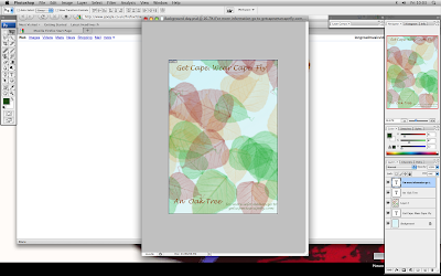
This is us in the process of making the magazine advert. We are using photoshop to create the back ground and the text then we are using a picture of us as the band to be the main picture.
Hollie - I found a brush tool on photoshop of the leaves in the background that I made bigger and used the colour tray to get different colour leaves. I used the text tool to create the writting and the dropper colour tool to make sure i got the same colour for all the writting. I then saved it like this so we can have a cartoon picture of all of us as a tree in the middle. This will be added at a later date.
Labels:
Emily Skinner,
Fern Clark,
Hollie Godden,
Pippa Atkins
Rough Cut
This is our rough cut version of Oak Tree by Get Cape Wear Cape Fly. We still have numerous animations to import into our final piece but this is the general idea so far.
Labels:
Emily Skinner,
Fern Clark,
Hollie Godden,
Pippa Atkins
Thursday 5 November 2009
Rendering

This is the longest time we have had to wait for the video to render so far... We expect a longer rendering time towards the completion of our video.
Labels:
Emily Skinner,
Fern Clark,
Hollie Godden,
Pippa Atkins
Target Audience
The target audience of our band is young teenagers. Our video also targets this audience with the bright colours and young characteristics on the tree and other pieces. The animals appeal to the younger audience as they are cute and friendly to look at. I think that girls are more interested in the band then boys are as the members of the band are probably more appealing to the girls.
Labels:
Emily Skinner,
Hollie Godden,
Pippa Atkins
Tuesday 3 November 2009
Analysis
So far our music video is going well. The idea is strong and unique. After planning out our video we have established our ideas and worked out numerous ways to present them to have the same conventions as if we were filming the scene with a camera. Shots like establishing shot, close ups and mid shots are all used.
The editing was the hardest bit of our video. Rendering took a very long time which slowed our video progress down. We knew numerous techniques already from previous media pieces that we were able to use in our piece. Without this previous knowledge our piece would have been even harder to produce.
Designing our characters on Photoshop went well as neither of us were very good with the program yet we still produce great characters. nimting all our individual pieces and importing them in was fairly easy and therefore i believe this went well also. To improve we could have had more variety in our video overall to make it more interesting to watch. This could have been done if we had more time and if we knew how long rendering would take. In the future we would take this into account and plan our timing better. We could have animated everything in different sequences and not have imported them until the last few lessons in order to get everything done and rendered quicker.
Labels:
Pippa Atkins