Evaluation
For our three media products we have a magazine advert, Digipack and a music video for ‘An Oak Tree – get cape wear cape fly’. This is an indie/pop song. Most indie/pop music videos would feature the band or singer but our doesn’t, however using animation makes it unique and surreal which you often see in this genre video.
On magazine adverts typical features that we noticed looking at professional products were, rating from a known radio station or television program, information of where to buy or where to go like a website, a release date and a photograph of the band or artist. We included all of these features for our advert and for the picture of the band we had our four group members posing as a tree. For example, our finished advert has five stars – kiss fm written on it. Also, we didn’t edit this picture as we thought the readers would need to be able to recognise the band if they did not know them by name. Because the picture was not from the video we also included characters from the video to relate the two.
Our digipack contained logos and information for viewers on the back cover, e.g. an age rating and production logo, track list, etc. We also had the background from the video on the front, back and spine of the digipack also with clouds so it was all the same theme. The font used also uses the same sketchy animated theme as it is a cartoon like handwritten font and the picture of the band has been edited and has had the colours changed and filled to block colours on the computer. On the front and the spine there is the bands name ‘Get Cape. Wear Cape. Fly’ and the song name that we used, ‘An Oak Tree’. All of these features are what we saw on professional digipacks when we researched them.
When thinking about creating the video we listened to the lyrics to our song we started to get lots of ideas. We looked at professional animated products, for example television adverts. One advert that stood out was a Ben & Jerrys animated advert. This felt like it showed a short story to the product they were selling and the way it was all animated and editing was very interesting and eye catching and always had your attention. The advert had a very obvious link to visuals and sounds and this inspired us for what we wanted to create. Features in our final video were, the use of bright colours, surrealism and it was very unique. Being animated with a cartoon theme it was very important to include the bright colours. Being animated meant we had a lot of choice in what we could create, for example we had a singing oak tree which shows the surrealism and how it was unique. A common feature to have is lip sinking with the footage of the singer and the track on the computer. We didn’t have a band member featuring so with the oak tree animated we could lip sink the mouth to the words. Like Goodwin’s points mentioned, we linked our lyrics with visuals for example when it says ‘stripping back to the bare branch’ we see the trees branches come through and loos his leaves.
The combination of all our media products creates a very strong indie/pop theme and genre. Because we used the same photograph on our ancillary texts it shows a clear link between the products even though one product is not the same background and pictures as the music video. The colour scheme for the digipack and the music video are the same how ever the magazine advert has as a bit more subtle and realistic colour scheme but still relates to the promotion of the song ‘an oak tree’. As the band is not well known we felt they needed to be seen on the magazine advert because the digipack only shows faces and the music video doesn’t include the band at all and it is important for the audience to make a link between the three products.
During the process of making our music video we had two stages where we could receive audience feedback before submitting our final video. This helped us to see what other people saw when they watched it for the first time as it is easy to get buried into work without realising some things. We received feedback on pitching our idea and were told what people thought about it and then we received more after submitting our rough-cut. It is important to get feedback from our target audience as we are trying to make the video appeal to them the most. Using this we were able to make changes to ideas and what we had already made. One thing that was pointed out to us was how the background didn’t fit in with what we had created on the computer to go into the video. We took this on board and changed our background which sets the scene of a park, to typical block colours for the sky and grass and added cartoon flowers into the grass. After making the change we realised how the older background didn’t fit in. Also after showing our rough cut we were told to make the pace faster. We used close-ups of the tree and other things like leaves and music notes to help created a faster paced video. I felt this worked as the choppier shots made it more interesting and changed the scene so it didn’t get too boring. We received one more lot of feedback after submitting our final video. Our audience noticed how all the visuals matched the lyrics and also commented on how it was unique. Our main criticism was about how the pace still didn’t feel fast enough for the song. If we had the chance the changes we would make would be to created more shots to make it more choppy and have more things going on in the scenes.
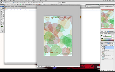
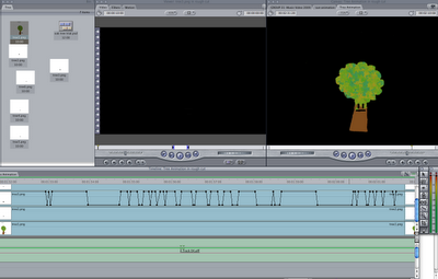
To be able to create our animated video we would have to use, Photoshop. Using Photoshop to create each animal or character in different layers meant we could draw a picture then save each layer so when it comes to animating we could move one layer at a time. To begin with it was difficult to use Photoshop as there is so much to it but once we learnt the basics it was easier to create different things and we discovered other features of the software and found out how to do things in an easier and quicker way. We also used Photoshop for the digipack and magazine advert. After creating our Photoshop images we then had to transfer them to a programme called Final Cut Express. In this programme we could put our images with sounds track. We could move each layer from Photoshop in a sequence which was saved and when played was an animation. To document our progress we were able to get screen grabs of the programmes we used and put them on our blog in a website called blogger.com. using blogger meant documenting all our computer was easier to do and we could also have it public for other people in our class or for our teacher look out and then comment on. This was also a good way of displaying and explaining what problems we faced creating animation. We could also import the images created for the video from Photoshop to the blog. After finishing our video we had to use a programme called QuickTime so we were able to publish our video on the internet using Youtune.com. We also had to publish our video to put it on to out blog. Having our video on Youtube meant anyone anywhere could watch our it. The biggest problem we faced with animation was rendering. In order to watch our video whilst making it we had to render the sound with the music and each animation together. This took up a lot of our time and we could have got more in our video if we didn’t have to wait to watch what we had just animated. But we managed to get round the problem and save some of the time by using another Mac to animate on then use a USB stick to transfer as we could not use final cut express whilst rendering. Without the use of all these websites and programmes it wouldn’t have been possible to make an animated video which is all computerized. It is so much faster and fewer complexes to anyone to create a video of there own and have it published over the internet now we have so much software available
Looking back on the video and how we had to create it I think we done well. We learnt a lot of things about the computers and software we used. If I were to repeat it again I think we should try computerized animation and creating a scene from hand then capturing freeze frames at the beginning after we had an idea so we could see which one would have worked. I was very happy with final outcome for all three products.
Friday, 11 December 2009
Evaluation
Our media products include a full length music video, a digi pack cover and a magazine advert. The track we chose to promote was an indie/pop song called An Oak Tree by Get Cape Wear Cape Fly. After researching the band we thought an animation for the video would work well as the genre left a wide variety of option for us as the conventions of the genre (indie/pop) also include alternative themes. Many indie/pop artists promote there music by including shots of them playing there instruments and having a ‘rock look’. The animation idea goes against these conventions and promotes the band as unique, making them stand out from other similar bands to their audience.
The animation we did created a narrative which linked to the lyrics which is one of Goodwin’s points. Goodwin’s points are numerous observations of conventions of a music video and many of these are seen throughout professional music videos. The genre of the song allowed us to make a video that did not even include an image of the band. The non representative aspect was established and works well with the genre of the song. If we had more time we would have included a greater variety of shots, edited at faster intervals to create better visuals for the pace of the song, however, with the time we had I think we did the best we could. We changed the scene of our video various times in order to keep the audience entertained but still keeping a similar style throughout.
The animations, bright colours and fun looking animals are also conventions of how to promote for a younger audience, almost childlike. To make sure our products still attracted the indie target audience we used some features that would normally be seen on their products, such as black font, ratings from popular music industries to their genre and the band are also seen in dark coloured clothes within the magazine advert. The dark clothes are usual of the indie music genre and this stands out against the brightly coloured background.
Our digi pack included conventions found in real DVD products such as, DVD video logo, certificate, ratings from well known music industries such as Kiss FM, a production logo and a bar code. We found these conventions from our own knowledge and while researching similar bands of the same genres digi packs. We included a running time on the back along with the names of the producers and production company. The bands website is clearly indicated so the consumer can find out more information. An image of the band is clearly shown on the front cover with the name of the band and album clearly surrounding it. The image of the band clearly resembles an oak tree which brings in visuals relating to the video reminding the audience of our other products. This also combines the two products together creating a clear link between them. This keeps the audience clear of the products they are buying and makes the minimum changes keep the focus on the product itself rather than the packaging it is contained in.
The magazine advert included an image of the band, like the digi pack, but without the cartoon editing. The rest of the magazine advert also includes conventions of real adverts such as music industry ratings, the name of the band and album and a website to find out more information. It includes similar imagery to the other media products such as the leaves in the background and the animals. Having consistency is one of the most important conventions to follow I believe as it keeps a professional feel as well as linking all the shots together in a smooth process. Without the consistency the piece may skip pieces out or make the piece not understandable. By continually checking our editing and by receiving feedback we were able to tackle this convention to keep our video looking professional.
The combination of our three media products contain evidence of continuity throughout to relate to one another. The cartoon presentation is included in all three products in numerous ways, such as the background of the digi pack and the animals in the magazine cover. The font is fairly similar in both the digi pack and magazine advert which is creates consistency making it stand out from other products and is bold to the audience. The styles of font, images and colours are all unique to the band and are all shown in a number of ideas that are really effective. The image of the band representing the title of the main song is rarely seen in other media products and is also unique, relating back to the conventions of the genre of music. The audience will recognise the images shown on the magazine advert with the music video and this may stand out to them, persuading them to purchase the product.
The music video and the ancillary texts work well together as they are clearly related to one another by the styles they consist of. The images of the dog, hedgehog and birds are all seen within the magazine advert and music video and this combines the two products well as the link is really clear. Other smaller details that link the products together can also be seen with such details as the font similarity within the digi pack and magazine advert. The leaves on the background of the magazine advert are to link the design with the song title as well as including the earthy colour scheme. It also gives the design a little bit of variety from the other pieces while still maintaining consistency. Keeping a link between all the products is important as it keeps the image simple for the audience and makes it clear to them that the product is the same that they have seen promoted. It also keeps to the conventions of the genre of the band and song to enable an understanding of what the consumer is really purchasing. It also means that the correct target audience are going to be interested in the product enabling the maximum potential for the product.
Our audience feedback helped us to realise we needed to add more detail on our blog and add more information about the decisions we made. One of the feedback points presented to us about our music video was that the digi pack and magazine advert should match the style of the video. Therefore we made sure we did this to keep a nice consistent theme. It also came from our audience so keeping them happy and introducing there ideas means that our overall product is going to be more specific to what they want creating better results. By using YouTube we were able to show our music video to other people and therefore receive more feedback. This meant we were able to see what people of other ages and locations thought, instead of just the people within our own media classroom. This left us with more suggestions to work with that we were able to incorporate into our final pieces.
To complete all our media products we had to become very good with Photoshop as it is included in all our pieces. I think we did very well with the knowledge we already knew and we have all improved greatly with the program to become confident with it. We were able to insert our images into Final Cut Express to produce our video and the outcome worked very well as the final feedback showed that the audience were impressed with our ideas and how we presented them. As the new media technology allows us to create more ideas and present them in a wider variety of ways we had greater opportunity to adapt our ideas and change them to suit our audience’s views. As the programs are designed to be democratic it did not take us long to become good enough at using Photoshop and Final Cut Express to create our finished products.
We used the internet to research for our products which is always easy to access. The internet is a new media technology and is being updated all the time. Anybody can add information to the internet and because of this there was a large number of resources available and there was always something we could use. Without the internet our resources would have been very much limited and the access to the information would have been harder as we would have had to have travelled to a music store or to someone with knowledge of the band to be able to gather ideas and find what we were looking for. We were also able to use the internet to research other media products that were similar to our ideas and the genre of our song. We were then able to extract ideas and conventions from our findings and use them to incorporate with our own pieces. The internet was also used to create a blog that we updated regularly to keep track of our ideas as well as planning and development stages. We were able to get feedback on the blog of our products and incorporate the results into our pieces which were very beneficial to us. We were also able to explain our ideas to our audience to create a better understanding.

Overall I think the hardest part of the whole project were using the new media technologies in a confident way and finalising our video. We had many problems with the time it took to render the video as when we left it for a long while before rendering; we had to wait well over an hour for it to be completed. During this time we kept our blog updated and carried on researching to create more ideas of what we could do to improve our video. We were also able to start research for our ancillary texts and gather ideas by following conventions. Editing our video was fairly easy and was just stressful when we had to wait to see what we had created because of the render waiting time. Having previous knowledge of Final Cut Express helped greatly as we were more confident and knew more about what the software was capable of. Without this knowledge our products would not have been as well developed and unique. However, I also think if we had more time we could have incorporated a few more images to create a more diverse visual display for our video and we could have added more animals and features to make the scene more realistic. The group I was with was good as we all shared similar ideas and we were all confident enough to express our individual ideas to create our final pieces. This was beneficial as we were able to use the best ideas and firstly see how well they worked, before finally deciding whether to keep them or not.
I feel that with the time we had, we were able to create products to our best ability and if we had more time we would have been able to produce more professional looking pieces. If I were to do this again I think I would try a different genre of music and a different media style. I think working in front of the camera would be easier than creating images from scratch like we did this time and this would allow us to have more time in the editing stages to create a more professional looking piece. I enjoyed the project and I believe I have learnt a lot from it, especially now that I can use Photoshop with more confidence.
Word count: 1952
The animation we did created a narrative which linked to the lyrics which is one of Goodwin’s points. Goodwin’s points are numerous observations of conventions of a music video and many of these are seen throughout professional music videos. The genre of the song allowed us to make a video that did not even include an image of the band. The non representative aspect was established and works well with the genre of the song. If we had more time we would have included a greater variety of shots, edited at faster intervals to create better visuals for the pace of the song, however, with the time we had I think we did the best we could. We changed the scene of our video various times in order to keep the audience entertained but still keeping a similar style throughout.

The animations, bright colours and fun looking animals are also conventions of how to promote for a younger audience, almost childlike. To make sure our products still attracted the indie target audience we used some features that would normally be seen on their products, such as black font, ratings from popular music industries to their genre and the band are also seen in dark coloured clothes within the magazine advert. The dark clothes are usual of the indie music genre and this stands out against the brightly coloured background.
Our digi pack included conventions found in real DVD products such as, DVD video logo, certificate, ratings from well known music industries such as Kiss FM, a production logo and a bar code. We found these conventions from our own knowledge and while researching similar bands of the same genres digi packs. We included a running time on the back along with the names of the producers and production company. The bands website is clearly indicated so the consumer can find out more information. An image of the band is clearly shown on the front cover with the name of the band and album clearly surrounding it. The image of the band clearly resembles an oak tree which brings in visuals relating to the video reminding the audience of our other products. This also combines the two products together creating a clear link between them. This keeps the audience clear of the products they are buying and makes the minimum changes keep the focus on the product itself rather than the packaging it is contained in.

The magazine advert included an image of the band, like the digi pack, but without the cartoon editing. The rest of the magazine advert also includes conventions of real adverts such as music industry ratings, the name of the band and album and a website to find out more information. It includes similar imagery to the other media products such as the leaves in the background and the animals. Having consistency is one of the most important conventions to follow I believe as it keeps a professional feel as well as linking all the shots together in a smooth process. Without the consistency the piece may skip pieces out or make the piece not understandable. By continually checking our editing and by receiving feedback we were able to tackle this convention to keep our video looking professional.
The combination of our three media products contain evidence of continuity throughout to relate to one another. The cartoon presentation is included in all three products in numerous ways, such as the background of the digi pack and the animals in the magazine cover. The font is fairly similar in both the digi pack and magazine advert which is creates consistency making it stand out from other products and is bold to the audience. The styles of font, images and colours are all unique to the band and are all shown in a number of ideas that are really effective. The image of the band representing the title of the main song is rarely seen in other media products and is also unique, relating back to the conventions of the genre of music. The audience will recognise the images shown on the magazine advert with the music video and this may stand out to them, persuading them to purchase the product.
The music video and the ancillary texts work well together as they are clearly related to one another by the styles they consist of. The images of the dog, hedgehog and birds are all seen within the magazine advert and music video and this combines the two products well as the link is really clear. Other smaller details that link the products together can also be seen with such details as the font similarity within the digi pack and magazine advert. The leaves on the background of the magazine advert are to link the design with the song title as well as including the earthy colour scheme. It also gives the design a little bit of variety from the other pieces while still maintaining consistency. Keeping a link between all the products is important as it keeps the image simple for the audience and makes it clear to them that the product is the same that they have seen promoted. It also keeps to the conventions of the genre of the band and song to enable an understanding of what the consumer is really purchasing. It also means that the correct target audience are going to be interested in the product enabling the maximum potential for the product.
Our audience feedback helped us to realise we needed to add more detail on our blog and add more information about the decisions we made. One of the feedback points presented to us about our music video was that the digi pack and magazine advert should match the style of the video. Therefore we made sure we did this to keep a nice consistent theme. It also came from our audience so keeping them happy and introducing there ideas means that our overall product is going to be more specific to what they want creating better results. By using YouTube we were able to show our music video to other people and therefore receive more feedback. This meant we were able to see what people of other ages and locations thought, instead of just the people within our own media classroom. This left us with more suggestions to work with that we were able to incorporate into our final pieces.

To complete all our media products we had to become very good with Photoshop as it is included in all our pieces. I think we did very well with the knowledge we already knew and we have all improved greatly with the program to become confident with it. We were able to insert our images into Final Cut Express to produce our video and the outcome worked very well as the final feedback showed that the audience were impressed with our ideas and how we presented them. As the new media technology allows us to create more ideas and present them in a wider variety of ways we had greater opportunity to adapt our ideas and change them to suit our audience’s views. As the programs are designed to be democratic it did not take us long to become good enough at using Photoshop and Final Cut Express to create our finished products.
We used the internet to research for our products which is always easy to access. The internet is a new media technology and is being updated all the time. Anybody can add information to the internet and because of this there was a large number of resources available and there was always something we could use. Without the internet our resources would have been very much limited and the access to the information would have been harder as we would have had to have travelled to a music store or to someone with knowledge of the band to be able to gather ideas and find what we were looking for. We were also able to use the internet to research other media products that were similar to our ideas and the genre of our song. We were then able to extract ideas and conventions from our findings and use them to incorporate with our own pieces. The internet was also used to create a blog that we updated regularly to keep track of our ideas as well as planning and development stages. We were able to get feedback on the blog of our products and incorporate the results into our pieces which were very beneficial to us. We were also able to explain our ideas to our audience to create a better understanding.

Overall I think the hardest part of the whole project were using the new media technologies in a confident way and finalising our video. We had many problems with the time it took to render the video as when we left it for a long while before rendering; we had to wait well over an hour for it to be completed. During this time we kept our blog updated and carried on researching to create more ideas of what we could do to improve our video. We were also able to start research for our ancillary texts and gather ideas by following conventions. Editing our video was fairly easy and was just stressful when we had to wait to see what we had created because of the render waiting time. Having previous knowledge of Final Cut Express helped greatly as we were more confident and knew more about what the software was capable of. Without this knowledge our products would not have been as well developed and unique. However, I also think if we had more time we could have incorporated a few more images to create a more diverse visual display for our video and we could have added more animals and features to make the scene more realistic. The group I was with was good as we all shared similar ideas and we were all confident enough to express our individual ideas to create our final pieces. This was beneficial as we were able to use the best ideas and firstly see how well they worked, before finally deciding whether to keep them or not.
I feel that with the time we had, we were able to create products to our best ability and if we had more time we would have been able to produce more professional looking pieces. If I were to do this again I think I would try a different genre of music and a different media style. I think working in front of the camera would be easier than creating images from scratch like we did this time and this would allow us to have more time in the editing stages to create a more professional looking piece. I enjoyed the project and I believe I have learnt a lot from it, especially now that I can use Photoshop with more confidence.
Word count: 1952


An Oak Tree Evaluation
In what ways does your media product use, develop or challenge forms and conventions of real media products?
Our video is an animation. We chose to do an animation because we thought it would be more interesting to link the lyrics and the visuals together for the subject of the song (an oak tree) also an animation is actually quite original seeing as not many other groups have done it. Our music video isn’t very good in the way that it represents the artist. As you can see the video is all an animation, so the artist is never actually seen in the video. But on the other hand it could be quite a good representation for the record company as its original and stands out so hopefully people will remember it more. Our genre is “indie” and you find most indie videos to be surreal much like our animation. And as it’s quite different from the average indie video it could appeal to audiences of a wider range. Even though there isn’t any music videos that are at all like ours I did find some videos that used elements of animation for example Major Lazor-Keep It Goin' Louder feat. Nina Sky and Ricky Blaze and Christina Aguilera-Car Wash and Kate Winslet-What If. But in all of these videos the animation only pops up in little bits unlike ours, which runs all the way through.
For our music video we managed to include one of the main suggestions of Goodwin’s points which was the lyrics relates to visuals. Goodwins points are a good way of learning some boundaries of making a music video.
In our music video we did not use the camera at all; all the work was done on the computer. We used Photoshop to create all the images and final cut express to animate them and put them all together. We also didn’t use any lighting as it wasn’t needed for the animation. The mise en scene in our music video was included all in the frame for example the type of tree we chose, the animals, the background, and what style the cartoon would be animated in. animation gives you a lot more freedom to mess around a play with the video to how you wanted. We weren’t given that much freedom with our specific video because of the detailed lyrics we had to stick to a certain animatic form. All of our video is basically the same shot, so you could say that the whole animation demonstrates that we watched other music videos with animation in, for example milkmaid by former Long Road students sort of inspired us, as well as the Ben and Jerry’s advert, which although it isn’t a real music video it still uses elements of animation and jolly music much like our video.
The similarities between our digipack design and some actual album covers I have seen is much like Kanye Wests graduation digipack. They both use animation. Kanye west uses the bear which is recognisable for him as an artist. If you see the bear you know that it is something to do with him, so you don’t even need a photo because he’s so famous. Where as our animation is of a tree, but we still have the images of our faces added in because obviously we aren’t that famous.We have used many conventions for a magazine advert in our magazine cover for example its got a 5 star rating which you can usually see on any song or video being released. It also says it’s out now, which you can also find. It’s got the title on it and the website, which you see on most adverts, so it can link you to further information about the product.
How effective is the combination of your main product and ancillary texts?
In our animation the main feature is an oak tree, which links to the title of the song “An Oak Tree” We linked up the ancillary texts by using the same image in the magazine advert, and the digipack, so it shows that all our products are actually connected. By using an image in the majority of the products it makes it pretty clear what the song is about. We used the same texts in both products so it would be easier to link them up. We connected our products up to the video in different ways for example the magazine adverts animals were also featured in the video. As well as that, the background that we used for the digipack was the background that we used for our actual video. And the font on both the magazine advert and the digipack was similar. The photograph of our group that I made to look like a cartoon oak tree stands out because it is quite original so hopefully people will remember it and it will promote the song and the band. By making all of our products so similar it makes it easier for the audiences to differentiate our band and our song from different bands and their songs. It is important when trying to promote a band or a music video that you keep continuity up so the audience is able to easily link up all the products to do with the band. That’s why we tried to keep our digipack, magazine advert and music video all very similar. You’re able to promote the song and the band if you have a special feature, for example our oak tree, everyone will connect the oak tree to our band and our song.
What have you learnt from your audience feedback?
We got feedback throughout the making of our music video, some from our teacher , and some from other groups in the class. We did find the feedback very helpful, and took what the audience said on board. The audience gave us feedback on the blog, our Digipack, the Rough-cut video, the advert and our final video. Sadly not all the feedback was positive but we listened to all the negative comments and used them to try and make our project better. Our music video has been put up on Youtube because it is a good place to get yourself noticed and promote your band and sadly our video has been on You Tube for about three weeks and has not yet received any ratings or reviews. One of our audiences made a point that there wasn’t much variation in the shots that we had, and we agreed so we added some different angles in for example when the musical notes and the leaves appear in the video, that got put in that was because of feedback. In a professional industry, feedback from the audience can make the difference between success and failure. That’s why sometimes you can get special previews in films so the directors and producers and makers of the film get a chance to listen to the feedback and make changes if they have too. Feedback is vital, because your product is aimed at the audience so if they aren’t happy with it you’ve got to change it to benefit them, as they are the people that can make or break your creation. Feedback from Our teacher told us that our screen grabs are really good in showing how we are getting on with the project and progressing through it all. We got a few positive comments for our final video people said it looked unique, time consuming, and the visuals matched the lyrics. We had hoped that the audience would notice these factors so was glad to see they had. They also said that some of the images could have been faster paced,I feel that the audience thought that the animation could have been a bit quicker to fit in with the animation. But it wasn’t terrible but I do understand where the feedback is coming from though. The effect of editing really reflects the pace of the song. Also the magazine and DVD cover should have matched with the music video. We didn’t want to make it completely match because we wanted to show the audience what else we were capable of other than animation.
How did you use new media technologies in the construction of research, planning and evaluation stages?
We used a wide range of new media technologies in the construction of our research, planning and our evaluation stages such as the internet, Photoshop, paint, Youtube, blogger, myspace, facebook, and final cut express we used the internet for research on the band ideas for the video and similar videos to see what other people had done and the variation between the different genres. We used Youtube to watch the different music videos and upload our video so it was available for the world to see. Blogger helped us keep a log of our progress and it helped us keep track of what we had to do and what we had done. We also were able to get feedback off this and look at other groups projects. We used myspace and facebook to try and get hold of the band; sadly we didn’t get any response. But we were able to get a bit more background information on the band and see how they promote themselves and the types of different songs that they have made. I used paint to create my own unique image of our group as an oak tree. Paint isn’t available on the pc Macs at college so I had to do this at home. Photoshop was used a lot in the making of our animation, the background, tree, bench, swing, sky, animals and of course the oak tree was created on this by just using simple tools such as the paintbrush. Without final cut express we wouldn’t have been able to animate our drawings, we were able to add effects, and put all the drawings together so it came out as a video and we were able to play around with it so it all matched in with the lyrics of the song. Technology places a vital role in our lives today, without it we wouldn’t be able to do so many things, stay in touch with friends, find out what’s going on in the world, upload pictures and listen to music and much more. The internet enables us to do so many things and it played a vital role in helping us with our music video. It also helps to promote things. The world wide web is used by the majority of people and is a great place to promote bands, videos and games as well as a lot more. For example the internet lets people from Australia watch our music video and read about our blog. Without the internet we wouldn’t have been able to log our progress or promote it, or upload the music video onto various different sites such as youtube and blogger. The internet is a great access point, and I think now in this modern world we would be completely lost without it, because everyone is so dependant on it.
Overall I am pleased with the outcome of our video, it took a lot of time to do and was a lot of heard work, and is the first piece of animation i've ever been involved in before. If I could make any changes I would have a bit more variation in the shots. But am glad it’s finally finished. And now feel that I am now more skilled in using Photoshop and final cut express.
1942 words
Thursday, 10 December 2009
Evaluation


For our music video task we chose the song An Oak Tree by Get Cape Wear Cape Fly. We chose this song because it immediately stood out to us because we had already discussed ideas for our music video. We decided to do an animation music video straight away because we thought this would be a great way to develop our computer skills and try something different. Once deciding on animation we then had to choose a song, we chose this song because once listening to it we thought it would link well with our original ideas. We also thought, because we would use graphic style on all three of our products, this would make our Digi Pack and Magazine advert stand out.
By looking at other media products we discovered conventions of other media products. For the music video, we watched a lot of animated music videos and adverts such as the Ben and Jerry’s adverts and Car Wash by Christina Aguilera. Both of these included some non animated features, however in our music video we chose to have the whole thing animation. By deciding on animation in our music video this challenges the convention of a music video because after looking at some music videos there was a small percentage that were animation. In the video we chose to link the music and the visuals because this would give more of an impact and the animated visuals would explain to the audience what the song is about. The song is fast paced however we chose to make the visuals slowly flow together because we thought this would be more effective. For the Digi Pack, we looked at a lot of famous artists DVD covers such as Madonna, Michael Jackson and Beyonce to see what their covers included. We found them to include a barcode, DVD logo, running time, track list, a production logo and a lot of colour. To follow the conventions, we used these on our Digi Pack. On our Digi Pack we used the font Biro in black; we thought this font looked good because it looked more like an indie Digi Pack, than just looking like something for a child. The image of the band on the font of our Digi Pack is a photo which has been adapted to look like a tree, this was done on paint. By making the image look half drawn it shows what to expect in the music video, and that because the song is called An Oak Tree by creating the image to look like an oak tree it shows that our video is going to be linked to the lyrics of the song. For the Magazine advert, we again looked at other magazine adverts to get an idea of what to include in ours if we were to follow conventions. By looking at other magazine adverts we found them to include a source for more information, a quote from an artist or newspaper, large bold font and a lot of different colours, other than the majority of magazine adverts were very different. To follow the conventions we decided to use most of the things a magazine advert would include. We used a quote from a radio station, large, bold font to show that the video is out now and a website for people who wanted more information. For the images on the front of the advert we used an image of the band and some drawn animals. By using the animals created on Photoshop again we created the graphic style to the advert.
The genre of the song is indie so by doing something different and not something you would expect to find in an indie video we would expect the video to appeal to a wider audience. A lot of indie music videos are of the band performing and there is a lot going on, however to challenge conventions we chose to use a simple idea and not include the band in the video at all. In our video we created a nostalgic feeling for the audience so that our video would not only appeal to indie music fans but to people who liked the video.
By making all of our media products similar it links them all and makes it obvious what the song is and promotes a clear identity of the band. Our song is called An Oak Tree and the video we created included an oak tree, so by using an earthy colour scheme on the ancillary texts all three products are related to each other. To link the ancillary texts we used the same image on both, however by having one original image and one image that has been transformed, it makes the ancillary texts look abstract and surreal. Drawn animals used on the front of the magazine advert were originally used in the video and the background of the Digi Pack was also originally used in the video. On the two ancillary products a similar font was used, this may be the typical font for the band so that the band is recognised or it could be just the font of the three products for the song An Oak Tree, therefore either the song or the band is identified. By using the same or similar features on the three products it makes it easy for the audience to distinguish An Oak Tree by Get Cape Wear Cape Fly next to other artists. The audience also may recognise characteristics from the products such as seeing the animals on the magazine advert and then seeing them in the video.
From other people watching and looking at our products throughout the construction stages and the final pieces we received a lot of feedback. Feedback can distinguish between success and failure. Creating a music video which attracts an audience is essential. Whether the target audience likes or dislikes the products is the most important factor because if the target audience doesn’t like the products then the products will not be successful. For our music video and ancillary products we received very helpful feedback because it included positive comments but also some constructive criticism. Throughout the construction stages whenever get received feedback we would take what the audience had said on board and adapt our products. We received feedback on our final music video, magazine advert, digi pack, rough-cut video and blog. Feedback on the blog was especially important because our planning stages were included on here and our main ideas so by getting feedback on this we could modify our plans to the audience’s preferences. After the final products were completed there was a range of feedback. Positive comments were that its unique, stands out over other music videos, the visuals matched the lyrics and the ancillary products tie in well with the video. We did receive some negative feedback which was that we should have used the image from the music video of the oak tree on the two ancillary products and the font should have been the same on the two ancillary products. If we had more time we would have used these negative comments to change our products. Feedback is really important in this kind of industry, market testing takes place before the video and ancillary products are released so that it can be determined whether the products are going to be successful, or a failure. After market testing, if the products do not appeal to the target audience then construction stages will have to commence to get the video to appeal to the target audience.
There are a range of new media technologies now available, however this was not always so. Anyone now can make a music video using the different technologies and they have been designed to be democratic so it wouldn’t take long for beginners to learn. The advantages of having new media technologies is that anyone who has a limited or a lot of knowledge of computers would be able to use the applications without much of a struggle. Also there is now a lot more you can do on these technologies than you could do 20 years ago, such as make an animated video using an application called Final Cut Express. However the disadvantages of new media products are that it’s quite hard to access of computers which have these technologies and buying a new computer with these new applications could become expensive.
When producing our music video we used Final Cut Express and Photoshop. We created the individual images on Photoshop and then imported them onto Final Cut Express to fit them together and animate them. Animating out images was the most time consuming part of creating all three of our products, this was because once animating these images we then had to wait for our video to render so that we could watch the animation to see if it looked good.
As a group didn’t really have a wide knowledge of how to use the new media technologies so in the planning stages of our products we put some time aside to develop our skills on the media technologies we were planning to use so that time wouldn’t be wasted on struggling to produce each media product, however at this point we did not realise how much time we would need to render the video because it was animation. Throughout the construction stages of our video a lot of the time was spent waiting for the video to render so that we could watch it. The longest time needed to render was 4 hours. However we discovered that you can render the video in a poorer quality which was quicker so less time was wasted and then when converting the video into QuickTime it would automatically render our video in a better quality. We used the internet to research our band and the conventions of other media products. A lot of information can be retrieved from the internet so this was helpful in the research stages. To get more information about the band we e-mailed them however disappointingly they didn’t reply, but we hope that they enjoy our products.
Overall, the planning and constructing of all three of our media products went as well as it could have gone considering the amount of time we had. If we were to do this task again I think that we would think more about the time needed to create and render an animated music video. Also I think if we had known that it would take a long time to render our video we would have used this time more efficiently creating our ancillary products. If we had more time then we would have made sure our music video was as good as it could have been by rendering the final piece so that we could check it instead of rushing and just Quick Timing it without watching it first. Animation and creating a graphic effect was a challenging task for us but as a group we are happy with our final products which we had put a lot of time and effort into.
1860 words
Script
Hollie -
Our media products were a music video, digi pack and magazine advert based on animation to an indie track by 'Get Cape. Wear Cape. Fly. - An Oak Tree'. We looked at a variety of professional media products and one that stood out was an animated Ben and Jerrys tv advert. This gave us an understanding on conventions needed. The design of our digi pack uses the background from the video we made and contains the same cartoon theme with the clouds in the sky and how there is a cartoon computerized oak tree. The fonts on the magazine advert and digi pack are similar and a picture of the band is on the magazine advert but the background is not the same as the video and the digi pack but still sticks with the same cartoon theme. The actual video was all animated so it is surreal which is what you often see in an indie/pop music video, also because it was all computerized we were able to get the bright colours for the cartoon effect.
Emily -
By making our media products similar it shows that they are all linked and it is obvious that all of the products are by the same band. By researching other media products on the Internet we found other media products to include a barcode, running time, DVD video logo and a production logo; we used these on our products. On our Digi Pack and magazine advert to the video we used the same earthy colour scheme and a similar font. To link the three media products we used the same background on the magazine advert as we had used on the music video, the cartoon animals on the digi pack and on the music video and the same photo of the band on the digi pack and the magazine cover.
Fern -
We got feedback throughout the making of our music video, some from our teacher Emma, and some from other groups in the class. We did find the feedback very helpful, and took what the audience said on board. The audience gave us feedback on the blog, our Digi pack, the roughcut video, the advert and our final video. Sadly not all the feedback was positive but we listened to all the negative comments and used them to try and make our project better. Our music video has been put up on Youtube because it is a good place to get yourself noticed and promote your band and video. One of our audiences made a point that there wasn’t much variation in the shots that we had, and we agreed so we added some different angles in for example when the musical notes and the leaves, that got put in that was because of feedback. In a professional industry, feedback from the audience can make the difference between success and failure. That’s why sometimes you can get special previews in films so the directors and producers and makers of the film get a chance to listen to the feedback and make changes if they have too. Feedback is vital, because your product is aimed at the audience so if they aren’t happy with it you’ve got to change it to benefit them, as they are the people that can make or break your creation
Pippa -
New media technologies mean more opportunity to get across our ideas in the way we really want to. Different pieces of software were designed to create a variety of media products. We used Final Cut Express alongside Photoshop to create our animation within our music video. We designed our individual characters and backgrounds in Photoshop and then imported them into Final Cut Express to fit them all together and animate them. Our final outcome worked really well and our video links well to the genre of the song and the target audience. The new media technologies are easy to use as they are designed to be democratic so it did not take us too long to become confident at using them. We also used to internet to research for our band and gather ideas for our final pieces. The internet allows us to have access to a wide variety of resources and we were even able to email the band! Unfortunately they did not reply.
Tuesday, 1 December 2009
Feedback
the products do promote the band,
you would have to no the band to realize its there's.
the DVD is a stronger product than the magazine cover
The product does have continuity of style similar colours, but should have used the actual oak tree in the DVD cover.
very bold and stands out, good creativity, images that were in the video it self which is effective.
it says kiss fm and thats only cambridge and ely.
feedback
Good use of font on the dvd cover however the font on the magazine ad should have been the same.
Ties in well with the music video
imaginative picture however it's kind of irrelevant
satisfactory information on case (special features etc.)
Ties in well with the music video
imaginative picture however it's kind of irrelevant
satisfactory information on case (special features etc.)
Friday, 27 November 2009
DVD cover
 This is our DVD cover. It includes all the conventions such as DVD logo, production logo, rating and bar code. It includes the track lists and run time. The colours and images are all related to our video to keep consistency.
1st week of youtube views
 In the first week of our video being on youtube we have managed to get 54 views. But, 0 comments and o ratings.
Thursday, 26 November 2009
Magazine cover

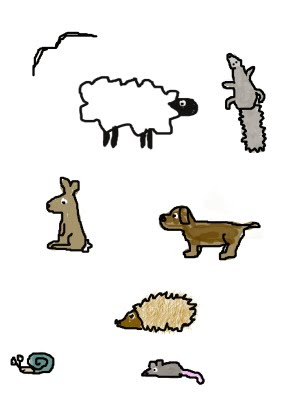
After reconsidering the conventions of a magazine cover we decided on this general image to promote our music video. The animals are from our music video to keep consistency and the leaves in the background keep the park theme. It features the band so that the audience knows clearly who the band are as they are not featured in the video.
We made it so our bodies look pencil drawn and we used the original picture so in a magazine people would recognize the band, where as if they were buying the DVD they would already know the band.
The rating has been added to show the audience how other music medias rate the album. The 'out now' text is clear so the date is obvious and the fans know they can purchase the album now.
Tuesday, 24 November 2009
Analysis of DVD/CD cover

 Below is the CD cover for Lil' Waynes album "Tha Carter III" As you can see from the picture of Lil' Wayne he has the same tattoos on his hands and face as the little boy on the album cover, suggesting that this was infact Lil Wayne when he was younger.It has got a very plain plain black background so all the focus is on Lil Wayne. Because the picture is of little wayne as a child, it could suggest that the songs are about his childhood and his life so far.
In the picture on this album cover, the writing is quite simple, but the top half says Lil Wayne in red, then you look at the picture of him and you can see he is wearing a red hat, so maybe the colour red means a lot to him. The parental advisory sticker that some of these songs could be quite inappropriate, and it says it has explicit content. By using a picture of a small child on a album with explicit content is quite risky as it could cause quite a lot of controversy. I think its very clever how they've made the little child seem to be a young Lil Wayne by putting all the tattoos on him, and the ring on his finger. It makes you wonder what all the tattoos mean, because hes obviously got them throughout his life so perhaps the songs might explain what they are and why hes got them.
Analysis of a dvd/cd cover
 This CD cover is for Beyonce, put a ring on it. Beyonce is known for her strong and powerful voice, which is similar to this CD cover because the silhouette of Beyonce stands out and looks strong over the plain background.
 When fist looking at this CD cover it portrays a mysterious look. The plain grey background makes the audience draw their attention to the silhouette becuase this is the main feature of the CD cover. The silhouette stands out above everything else on the CD cover becuase the silhouette is of Beyonce. This Cd cover wouldnt be as effective if beyonce was not as well known as she is because without even looking at the text we know straight away that it is Beyonce as the silhouette.
The text is simple but effective. Just by the word beyonce we know exactly who it is even though the silhouette covers one of the letter we still know that it says beyonce. The text takes up over half of the background and the effect where the colour of the text is white in the centre and then gets darker as the size increases makes the text stand out. Although the CD cover is simple and doesn't have much on it, it's big and bold so it is very effective.
The CD cover also links with the song. The name of the song is called single ladies, the picture of beyonce on her own could be showing that she is a single lady.
DVD/ CD cover analysis
 This image is used for a CD and DVD cover for Madonna. She is so idolized that there is no need to add too much detail to the design itself,even someone who is not a big fan of her music, knows who she is because she is in the medias eye so much. She has used this to her advantage as the overall product is rather simple yet eye catching.
The bright colours are eye catching and they represent the genre of music as well. The music is fun and fast paced and the colours imply this. Her name is clear to read along with the name of the album, it is drawn on as though paint has been splattered across the page which again give the feeling of being unique and slightly wild. 'Celebration' is also the name of one of her more popular songs and therefore fans will see this and want the rest of the songs.
Magazine cover
 In this magazine advert for Micheal Jackson - Thriller the first thing we see is the main heading "BIG DEAL". This is too make you want to know what it is about and read on.
The colour scheme in this advert is very dull to match the narrative of the song and the lyrics. Micheal Jackson and the writing are the only things that stand out by using a vibrant red for his clothes and gold with white for the text. The red used for Micheal Jackson makes him stand out like hes an icon.
The characters on the the advert also feature in the music video in the same way . it is very effective how they all looking towards you because it is very surreal like the song and the music video.
The phrase "Trick or Treat Keep The Little Ones Safe..." is significant to Halloween and gives you a taste of what to expect in the video by making you think about all the people in the picture coming out into the streets.
The name of the artist, Micheal Jackson is not as clear as the rest of the text. This shows he is well known and idolized.
The video also contains the album and song name and a quote saying "The worlds biggest selling album of all time." This will make the person want to listen to it because its actually been quoted in the advert.


This image will feature in our magazine, and/or our DVD cover. I created this image on paint, it took about an hour and a half. We posed all together to try make the shape of a tree, then I took the image and traced over it to make it look like a cartoon and an oak tree. I am quite pleased with the outcome. I decided not to do the faces, because the image was so small it was hard to get any detail. Plus I think it would be nice for the "fans" to see what the band really looks like.
Thursday, 19 November 2009
Feedback to final video
-Unique
-Looked time consuming
-Visuals matched lyrics
-Could have had faster paced images
-The magazine cover and DVD cover should match with music video
-Looked time consuming
-Visuals matched lyrics
-Could have had faster paced images
-The magazine cover and DVD cover should match with music video
Digipak
A digipak is a glamorous style of CD or DVD casing. We will be using a DVD digipak for our music which will include some features that are seen throughout our video.
The conventions of a dvd/cd for an album are:
Our magazine and dvd cover shall continue the themes expressed in the music video and carry over some of the images to keep some consistency.
The conventions of a dvd/cd for an album are:
- they feature the band on them clearly
- the colours represent the genre e.g. dark dull colours for more depressing song
- the font is bold and clear so the audience can read it clearly
- the dvd logo should be shown on the dvd cover
- the price may be shown
- a copyright logo should feature on both
Our magazine and dvd cover shall continue the themes expressed in the music video and carry over some of the images to keep some consistency.
Tuesday, 17 November 2009
Looking back
Looking back to the Ben and Jerrys advert we think we did well in creating our music video with the same sort of theme and cartoon like features.
Scarf

After watching the video we feel that we need to add some things in to fill some gaps where isnt alot happening so we are going to add a scarf to the tree when it is bare which i made on photoshop.
The final lesson
In our Final lesson Me Emily and Pippa rendered the whole video to be quicktimed to make the final deadline. During this lesson we managed to add clouds to the sky and were able to watch the whole video as one. We played around with the contrast and colour saturation to see if it made the cartoon effect more effective but we decided it looked better as it was. Also we got the chance to review our blog whilst the rendering was taking place. Pippa and Emily put the clouds in the sky in this time as we felt it needed something else to fill the screen and i added the scarf in.
Editting evening
Me Emily and Fern came in for an editing evening for 3 extra hours to work on our video. This was a great opportunity to catch up on lost time due to rendering and touch up the video. We also got advise and feedback from other media teachers. During this time we created close ups of the tree to have a change of scene. Emily also animated a squirrel going up the tree and I created the music notes thats flash up and fill the screen.
Thursday, 12 November 2009
New Background


We decided to change the whole background of our animation as we didnt feel the previous background worked that well with the rest of the animations. As you can see the image on the left looks less realistic than the one on the right, therefore fits better in with our theme.
Tuesday, 10 November 2009
Teacher Feedback on Blog
This is looking much better now - the use of screen grabs is really working to illustrate how you are progressing and the problems you have encountered as a group. Well done and keep it up.
Friday, 6 November 2009
Screen Grab

This is us in the process of making the magazine advert. We are using photoshop to create the back ground and the text then we are using a picture of us as the band to be the main picture.
Hollie - I found a brush tool on photoshop of the leaves in the background that I made bigger and used the colour tray to get different colour leaves. I used the text tool to create the writting and the dropper colour tool to make sure i got the same colour for all the writting. I then saved it like this so we can have a cartoon picture of all of us as a tree in the middle. This will be added at a later date.
Rough Cut
This is our rough cut version of Oak Tree by Get Cape Wear Cape Fly. We still have numerous animations to import into our final piece but this is the general idea so far.
Thursday, 5 November 2009
Rendering

This is the longest time we have had to wait for the video to render so far... We expect a longer rendering time towards the completion of our video.
Target Audience
The target audience of our band is young teenagers. Our video also targets this audience with the bright colours and young characteristics on the tree and other pieces. The animals appeal to the younger audience as they are cute and friendly to look at. I think that girls are more interested in the band then boys are as the members of the band are probably more appealing to the girls.
Tuesday, 3 November 2009
Analysis
So far our music video is going well. The idea is strong and unique. After planning out our video we have established our ideas and worked out numerous ways to present them to have the same conventions as if we were filming the scene with a camera. Shots like establishing shot, close ups and mid shots are all used.
The editing was the hardest bit of our video. Rendering took a very long time which slowed our video progress down. We knew numerous techniques already from previous media pieces that we were able to use in our piece. Without this previous knowledge our piece would have been even harder to produce.
Designing our characters on Photoshop went well as neither of us were very good with the program yet we still produce great characters. nimting all our individual pieces and importing them in was fairly easy and therefore i believe this went well also. To improve we could have had more variety in our video overall to make it more interesting to watch. This could have been done if we had more time and if we knew how long rendering would take. In the future we would take this into account and plan our timing better. We could have animated everything in different sequences and not have imported them until the last few lessons in order to get everything done and rendered quicker.
Thursday, 22 October 2009
Still to be done
We still have a large amount of work to be done as rendering is taking up the majority of our time at the moment. To complete our piece we need to do the following:
The task that will take the longest is rendering but this can be done when we are using the other computer to finish our blog or during lunch times etc.
- import a few more animations to fill out our song
- make sure all our song has something interesting to look at in the video
- edit a number of images to perceive the effects of a different camera angle (close up)
- add more animals to create more visuals
- add in our fountain animation
- update blog
- final response to emailing the band needs to be found and uploaded to the log
The task that will take the longest is rendering but this can be done when we are using the other computer to finish our blog or during lunch times etc.
Saturday, 17 October 2009
Winter Tree
To create the tree with know leaves Me and Emily used the normal tree as a template on photoshop and used new layers the take out the leaves in sections then have the branches popping up like they were starting to show from the winter weather described in the lyrics.
Friday, 16 October 2009
Flowers

Waiting for the rendering to be finished we created flowers to add to the background. This will add more colour to the video and is an interesting feature to look at. The colours are bright and different which fits with our conventions of our music type.
Problem

We soon discovered by animating our video we were to spend large amount of time waiting for it to render. At one time we had to wait about 45 minutes. We know this time will probably get longer as we import more files into our final piece. However, we are using another computer to edit other images and animate before importing to our final piece.
Thursday, 15 October 2009
The Evergreen

This is the evergreen design that we created on Photoshop using the same paint brush tool that we have used on the majority of the other design. Again its quite plain because we want the focus to be on the oak tree. This will be used in the chorus, appearing when the lyrics say "but you and i were not designed to be evergreens i guess"
Background

This is the design for the background that will be used in our music video. It was done in Photoshop, using the paintbrush tool. Its quite plain because we want the main focus to be on the oak tree. It is meant to represent a park scene which will be clearer when other images will be added, such as a bench and fountain.
Tuesday, 13 October 2009
Animating our images
Once creating our images on Photoshop we have to save those images for web and devices on Photoshop so that the images will be able to be imported to Final Cut Express. When creating the images we did them on different layers to give us the option of animating each layer. We then had to save each layer and put them into a folder. Then we imported the folders on final cut. We are now animating the images in different sequences so that once each image is animated all the sequences can be dragged onto the final sequence, which makes the final sequence look more tidy.
Blog Feedback from teacher
Your blog is very visually interesting and should be to reflect your idea which is great. However, it is lacking description and explanation. For example, one of you first blogs is of influences but you must discuss why they are your influences - in detail if you are to go for the high marks. Also your analysis of the Streets video seems a little out of place - should you place it somewhere else? - earlier perhaps? I recommend you go through all of your posts and see if you can add to it in terms of makng your idea very clear to a moderator - your blog needs to speak for itself. Most importantly I think you need a shot list to go with your animatic as on its own it is not clear. It is such a shame if you don't communicate your amazing idea.
Friday, 9 October 2009
Screen Shot
 Here is some evidence of our animating. We are making the oak tree sing in the chorus. From then on we can copy it into other times when the chorus is played and edit the background but keep the main singing going. This will save us some time and it will still work really well.
The lines on the timeline show when the lower lip is on screen to have the same effect as singing the lyrics.
Thursday, 8 October 2009
BLOG SUGGESTIONS FROM TEACHER
BLOG SUGGESTIONS
Remember to LABEL EACH POST so the examiner knows who has been putting the work in.
Stuff to include: Notes from every meeting you have with your group. Remember: you’re a production team now, not a bunch of students. If you have any differences of opinion, mention them, chart how you reach certain ideas and choices – use it as a diary of the project’s development.
Mood board – a collage of images, writing fonts and ideas that capture the tone and look of the project. Either collect pictures from the internet (flickr, google) and put together in Photoshop. Or cut up magazines and paste onto paper – then take a digital photo.
Influences – embed music videos, clips from TV, film trailers, experimental film – anything that has helped shape your vision of your project. Then write up just how the clips have influenced you, mention intertextuality, and even if you don’t end up using these influences then say just why.
Similar music types or video – embed examples from youtube etc and explain which codes and conventions you’ll be looking to use. Use Goodwin’s theory (it is on the blog) to the criteria to structure your analysis.
An email to the band to demonstrate that you understand issues surrounding copyright
Song lyrics and your interpretation of them.
Test shots – any footage you’ve taken to experiment with an effect.
Digital photos of locations, costumes, props, lighting,
Storyboards, timeline, shot list – take digital photos.
For DVD covers, magazine ads - CD covers, tour adverts, adverts and logo that catch your eye – take pictures of, embed from the net or post a link to.
Look on Photoshop tutorial sites for ideas of effects and fonts you could potentially use and learn just how to create the look you want. Remember this is marketing so make it appropriate to the type of consumer the music/video is intended for.
Podcasts! You can do Podcasts – just as long as they sensibly put together and are to the point. An intelligent discussion about parts of the planning, different techniques or even a Director’s commentary would make a great post.
ANYTHING AS LONG AS IT IS CONSTRUCTIVE, WELL PRESENTED AND RELEVANT!
Our responses to feedback
We will take the feedback and use it to improve our blog. For example adding explanations to out ideas to make them more clear and expanding current information. We will add more info about what we will do. We will also add our auteur work, teacher feedback and a list of what we are planning to do in the future weeks.
Feedback From Class
- Why is Ben and Jerry's advert is inspirational?
- Good magazine advert.
- Animatic Good.
- Individual analysis is good.
- Needs more info about what you have done and what the ideas is.
- Clear drawings, but missing some explanations.
- Overall good blog that includes everything apart from explanations.
- Lacking a detailed pitch.
- Well described.
- Good use of relative videos.
Wednesday, 7 October 2009
Call Sheet

We would have used a call sheet if we were filming, for the cast and crew. To show the details of the shooting day and when actors will have to be around to film.
The bench design
 This is the design for the bench that will feature in our music video. It was designed in Photoshop, I got a photo from Google of a bench, then just copied over it with the paintbrush tool. I did this because I found it too difficult to get the bench to look right by doing it free hand. I think it looks very effective.
Friday, 2 October 2009
Animals

I designed all these animals in Photoshop. i drew them free hand, These animals will feature in our music video.I picked these animals to draw because i assume you find a few of these wondering around in a park.
Sun design

This image was made on Photoshop and we are going to use it in our music video. On final cut express we are going to animate this image by making the orange rays pulse.
oak tree animatic
The animatic shows what we are going to do in our music video. Although the animatic doesn't show and any of the animation we are going to do to the cartoon characters. All of the images in the music video are going to be hand draw or made on Photoshop, so the animatic is quite similar to what we will actually do in our music video.
E-mail to band

This is the email to the band telling them about what we are doing with their song. We hope for a response because this will show they are interested in our ideas and they may give us some information to help towards our video.
Thursday, 1 October 2009
The Prodigy – Warriors Dance
The Prodigy are a drum and bass / dance band that use electronic beats to make their music unique and stand out from other similar bands. Their music video, warrior’s dance, is a particular piece that shows exactly what they can do.
It fits in with the genre characteristics by showing a unique quirky video that does not show the band at all. This is rather conventional of a drum and bass / dance video as the focus is mostly on the music and in most cases the band are not even known to look at. There is a slight narrative to the video as the cardboard cut out men are acting like warriors.
The cardboard warriors relate back to the title of the song name, but with very little words in the song there is not really much else to work with.
The music has a strong fast paced beat and the majority of the time the images on screen are also fast paced with the warriors dancing for example. This would be an illustrative relationship.
The band are not shown in the video and therefore are not really meeting the demands of the record label, although there music is unique and the videos are always pleasing to watch as they are always entertaining. This could be what the band is going for.
There is not really frequent reference to notion of looking as the video is all animated although it is enjoyable to watch.
I was not aware of any intertextual reference as the video, like many of their others, is unique and different.
Analysing a music Video- The streets- Fit but you know it.
Analysing the music video for “The Streets- Fit but you know it,” using Goodwin’s points
1. This music video demonstrates the genre characteristics for typical garage video its music genre is UK garage. The video is sort of grotty, but at the same time bright and funny. With really descriptive lyrics. It really plays on the stereotype of a young "lad". For example a man who goes out drinking with mates and obsesses over cars and girls.
2. In this video there is a definite relationship between the lyrics and the visuals. The lyrics are very descriptive, and tell a story, and the music video shows the images of the story, for example the lyrics say –“That blue Topshop top you’ve got on is nice, bit too much fake tan no but yeah you score high” and it shows a photo of a girl looking slightly orange in a blue top. This makes the music video more interesting because you are actually seeing what you’re hearing.
3 There is also a strong relationship between the music and the visuals, because the song is quite up beat and the video is quite up beat too, like the images from “his night out” and when he’s walking along, it all matches the music. For example if it was a depressing beat you would not have pictures and clips like that.
4. There is obviously a high demand for the record label, there are many close up shots of the artist, he is the main feature in the video, and you can clearly see his face and who he is. Mike skinner usually has someone singing with him for the chorus or something, and that appears the video with this other man on the beach.
5. In this video there is actually a frequent reference to the notion of looking. There is like a video within a video, as most of the video is based around Mike Skinner looking through his photos from the night before, the photos tell a story, and are sometimes still, but some of them have movement in them which makes the video even more interesting.
6. This video does have an intertextual reference to the film “Football Factory”. It can be found on the extras on the DVD and features three of the actors Danny Dyer, Frank Harper and Roland Manookian, they only have a short part in the video, but its sort of promoting how its a “lads” video, because the majority of men appear to like football factory, and its talking about chasing after a girl.
Wednesday, 30 September 2009
Hollie Godden music video analysis
Keri Hilson - Knock You Down
Knock you down is an R&B track. A typical feature in an R&B music video is to show a relationship between a male and female character. Knock you down contains a relationship between Kanye West and Keri Hilson. As the video goes on it changed to Ne-yo and Keri Hilson.
As certain word is said we see a picture or small clip of it on half of the screen. For example when Kanye West says the word 'nasa' we see rocket smoke on half the screen. Also another one is when Kanye west says hour glass we see an hour glass with the sand slowly falling down. Showing a relationship between the lyrics of the song and the picture we are seeing is very common in R&B music videos.
Knock you down is a very fast up-beat song. Most of this video is shot in slow motion which goes against typical R&B music videos but as we see pictures and clips flash on the screen it picks up the pace to go with the beat.
In this video we see lots of close-ups of Keri Hilson and Kanye West at the begining but as it goes on we see more of Ne-yo not kanye west. This shows that Keri is the star of the video.
Theres a part in the video before ne-yo comes into it when Keri and Kanye are very close. This is what we would expect to see in an R&B music video. This gives the feeling that viewer is looking on them.
This video also contains lyrics and dance moves from another of Ne-yos songs - Mrs Independant. He repeats the same dance move to the lyrics in one of his own videos.
Analysis of a music video using Goodwins points
Music Video analysis
Lady Gaga – Paparazzi
The genre of Lady Gaga paparazzi is pop. One of the characteristics of the music video paparazzi by Lady Gaga is that it has a very story narrative. Another characteristic is the Lady Gaga is performing in the music video as the woman who gets pushed off the balcony, which is a characteristic of pop videos. This video is quite conventional towards a pop video. The style of the video is very up to date and modern which is consistent in a lot of pop videos. However the video also challenges the conventions of a pop video by the length of the video. This video is 7 minutes 53 seconds, whereas in a lot of pop videos the length of the video is about 3 or 4 minutes.
The lyrics talk about what it’s like being the paparazzi and what they do for example ‘need that picture of you’. This relates to the image because there are scenes where there are paparazzi taking hundreds of photos. The song is quite past paced, which relates well with the visuals because the editing is done so that there are short duration shots to link with the music. At times the images cut at the same time as the beat.
There are a lot of close ups of Lady Gaga in this music video showing that it is Lady Gaga and by using close ups we can see her unique style more clearly which reminds us that its by Lady Gaga. Lady Gaga is known for her unique style and this is portrayed throughout the music video to add her own style. She is well known for her crazy outfits, which are unique and typical for Lady Gaga. The video also shows off that she can dance as well as sing which adds to the performance.
There is a good indication of notion of looking where it looks like we are the paparazzi looking through the camera taking photos of Lady Gaga. This creates the illusion that the audience are taking the photograph looking through the camera.
